Portfolio
Product Design, UX Design, Graphic Design
Selected Projects:
a — Osmos: Product, UX/UI Design
b — SWIMMERS: Lead Website, UX, Graphic Design
c — Shoreline Health: Lead Product, UX/UI, Graphic Design
d — MarketDial: Product, UX/UI, Lead Website Design
e — Tulie Bakery: Lead UX, Website Design
f — Bout Time Pub & Grub: Lead UX, Website, Graphic Design
Osmos
Product UX/UI
2022-2024
I’ve had the privilege of working as a UX/UI designer at Anchor & Alpine, and my ongoing project with Osmos, a first-mile data ingestion startup, has been a significant part of my journey. Our collaboration with Osmos focuses on crafting an engaging and user-friendly product UI/UX. This project has spanned almost a year and has seen the continuous evolution of Osmos’s platform, with a relentless focus on improving the user experience and introducing features to meet evolving user needs.
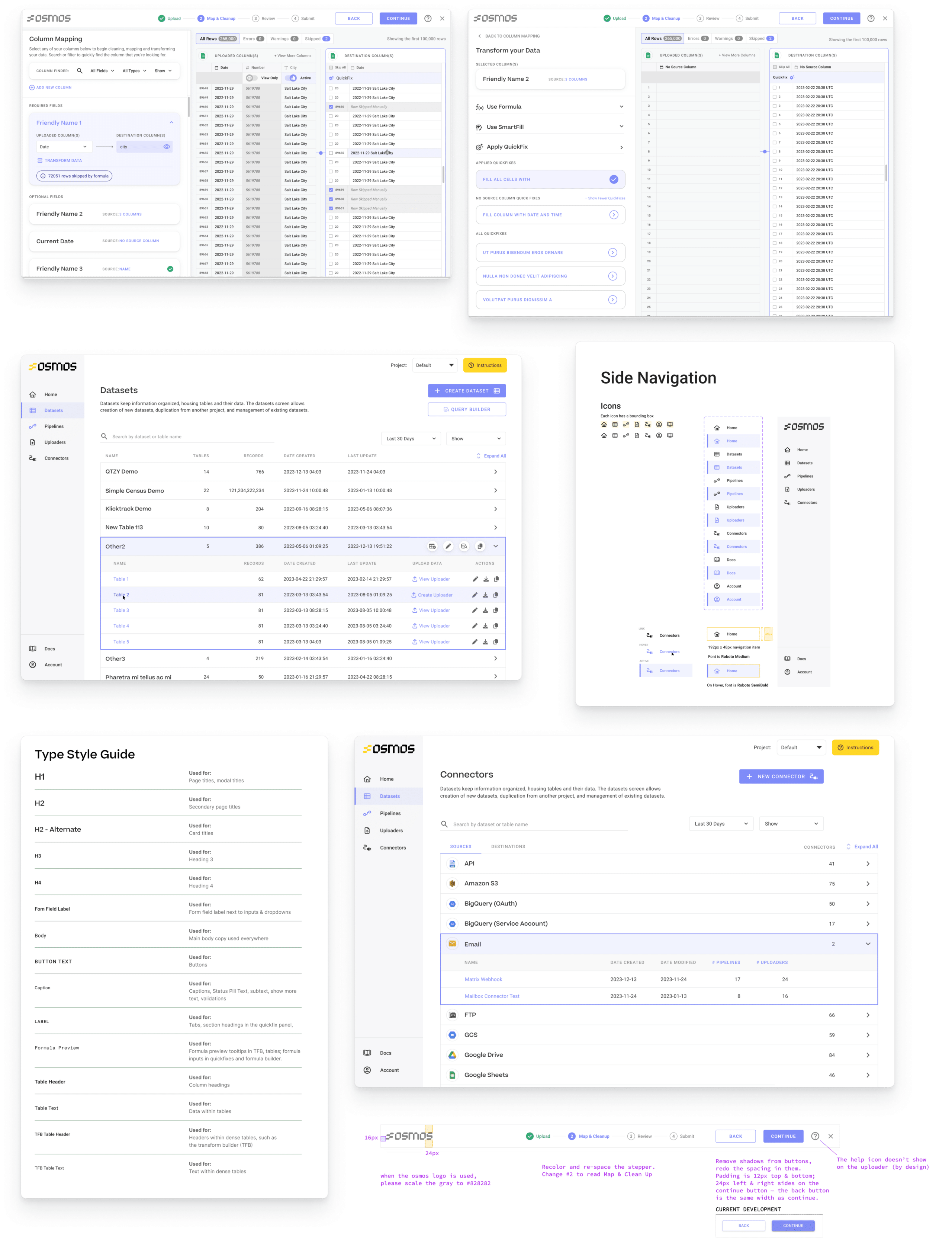
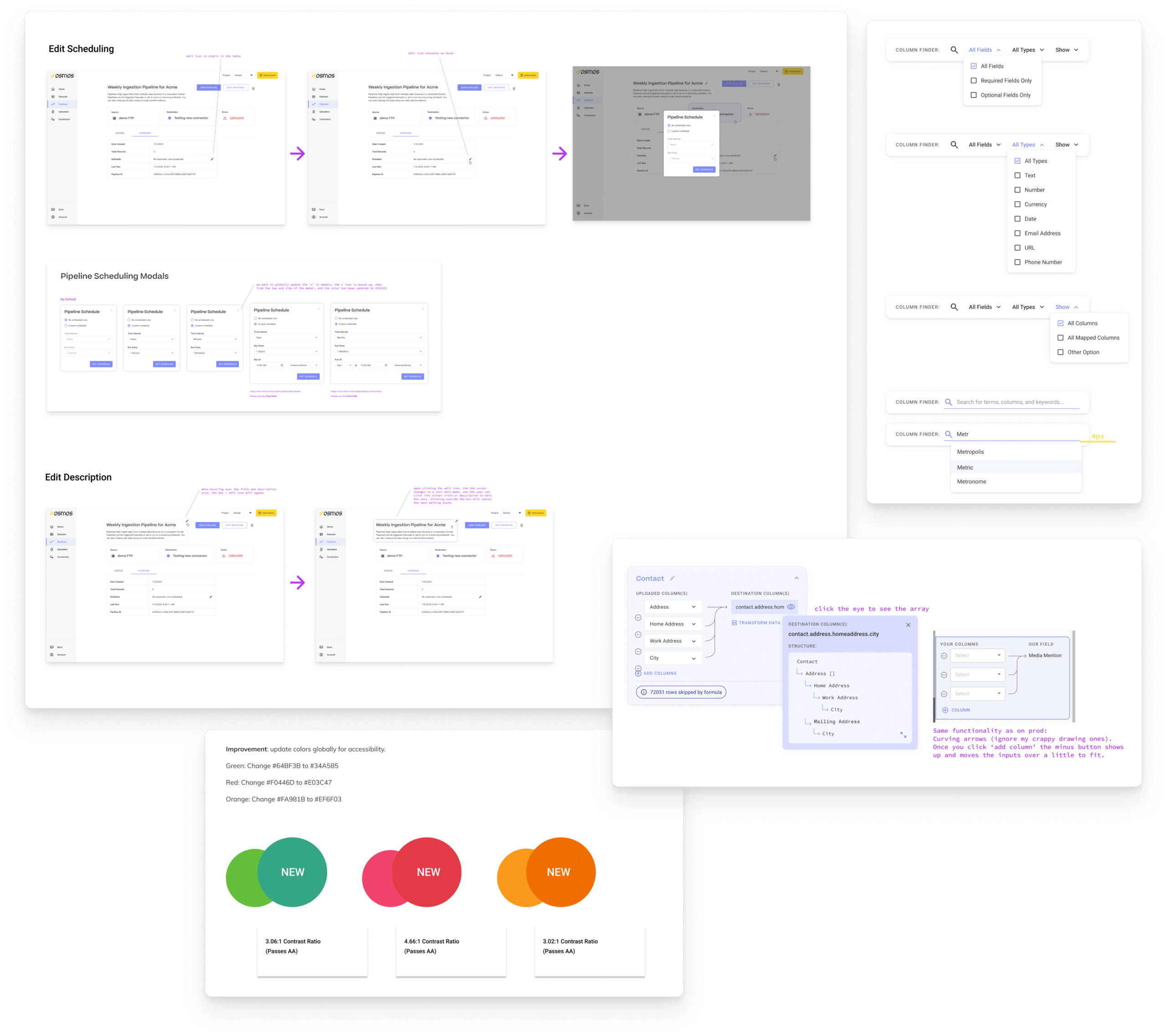
One of our initial areas of concentration was color accessibility. It was imperative to ensure that the product’s UI was designed inclusively to accommodate all users. We meticulously evaluated and adjusted color palettes to enhance the overall user experience. This step was a foundational move, reflecting our commitment to creating a platform that is user-centric and accessible to a diverse audience.
To further guide our design decisions and ensure alignment with the target audience’s needs, we developed personas. These personas played a crucial role in shaping our design choices and helped us create a product that resonated with Osmos’s users.
As a UX/UI designer on this project, I have been deeply involved in a comprehensive redesign of the product’s user interface. Our efforts have resulted in improvements in discoverability, usability, and a modern, clean aesthetic. This redesign has significantly contributed to Osmos’s business growth and its ability to stay competitive in the industry.

1. New Colors: I introduced a fresh color scheme, infusing a new visual energy into the platform. These colors were not only aesthetically pleasing but also carefully chosen to enhance the overall user experience.
2. Crafted Components: New design components were created to improve the user interface’s functionality and visual appeal. These components played a crucial role in making the product more user-friendly and attractive.
3. Re-designed Type Styles: Type styles were revamped to ensure optimal legibility and aesthetics. Typography is a fundamental aspect of any UI/UX project, and our redesign elevated Osmos’s product to a more professional and user-friendly level.
4. Navigation Menu Redesign: The app’s navigation menu was overhauled, making it more intuitive and user-friendly. This enhancement not only streamlined the user’s journey but also contributed to the platform’s overall modernization.
5. Homepage Area Redesign: Alongside a colleague, I tackled a complete redesign of all the product’s main homepage areas. This effort not only improved the overall look but also enhanced user engagement and functionality.
6. Close Collaboration with Developers: Working closely with Osmos’s development team, we ensured that the product remained consistent with our high-fidelity mockups. This collaboration was pivotal in bringing the designs to life and creating a seamless user experience.
7. Enhanced User Flows: Almost every essential user flow within the product was touched upon and improved. These enhancements have streamlined processes, making it easier for users to achieve their goals efficiently.
In conclusion, this project has been a journey of continuous improvement and innovation. We’ve consistently strived to create an engaging, inclusive, and modern UI/UX for Osmos’s first-mile data ingestion platform. The ongoing nature of our collaboration reflects our dedication to maintaining the platform’s relevance, user-friendliness, and alignment with Osmos’s evolving business objectives. Our work has not only elevated the product but has also played a significant role in Osmos’s growth and success in the industry.
SWIMMERS
Website UX/UI Lead, Graphic Designer
2019-Present
SWIMMERS, a vintage clothing business situated in Salt Lake City, stands as a destination for enthusiasts of vintage Americana clothing and style. SWIMMERS serves its clientele through various channels, including a physical storefront, social media platforms, and an online shop. As SWIMMERS’s go-to graphic and UX/UI designer, I’ve embarked on a collaborative journey with them that has been a vital part of their business success.

My partnership with SWIMMERS began in 2016 when I was a customer and was deeply inspired by the vision of my friends who own the shop, as well as the unique identity of their brand. Impressed by SWIMMERS’ unwavering dedication to vintage fashion, I started contributing design projects to their brand. Over the years, the scope and scale of our collaborative projects have expanded in line with their business’s growth.
A central element of our collaboration was the creation of SWIMMERS’ online shop, a critical facet of their business strategy. The designer selected the CMS Cargo as the platform for the website, citing its content management capabilities and commerce platform, tailored to SWIMMERS’ requirements.
The challenge was to develop a website that harmonized seamlessly with SWIMMERS’ aesthetic sensibilities, and their unique product release strategy. SWIMMERS releases ten items at a time and promotes them via social media, demanding a customized design. I crafted a website that embodied a minimalistic yet playful, classic yet innovative aesthetic, faithfully reflecting SWIMMERS’ brand.
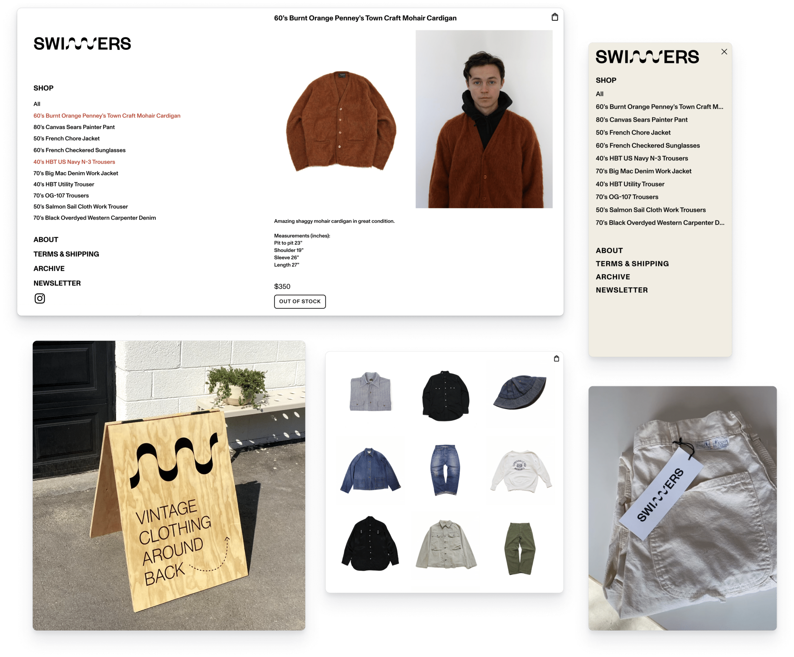
The website design allows users to shop in various ways, aligning with SWIMMERS’ unique product release schedule. Users can choose to click on individual items from the homepage list, view all items in a grid, or navigate through the entire collection sequentially by selecting a single item. This flexibility empowers SWIMMERS to effectively engage their audience and showcase their vintage offerings.
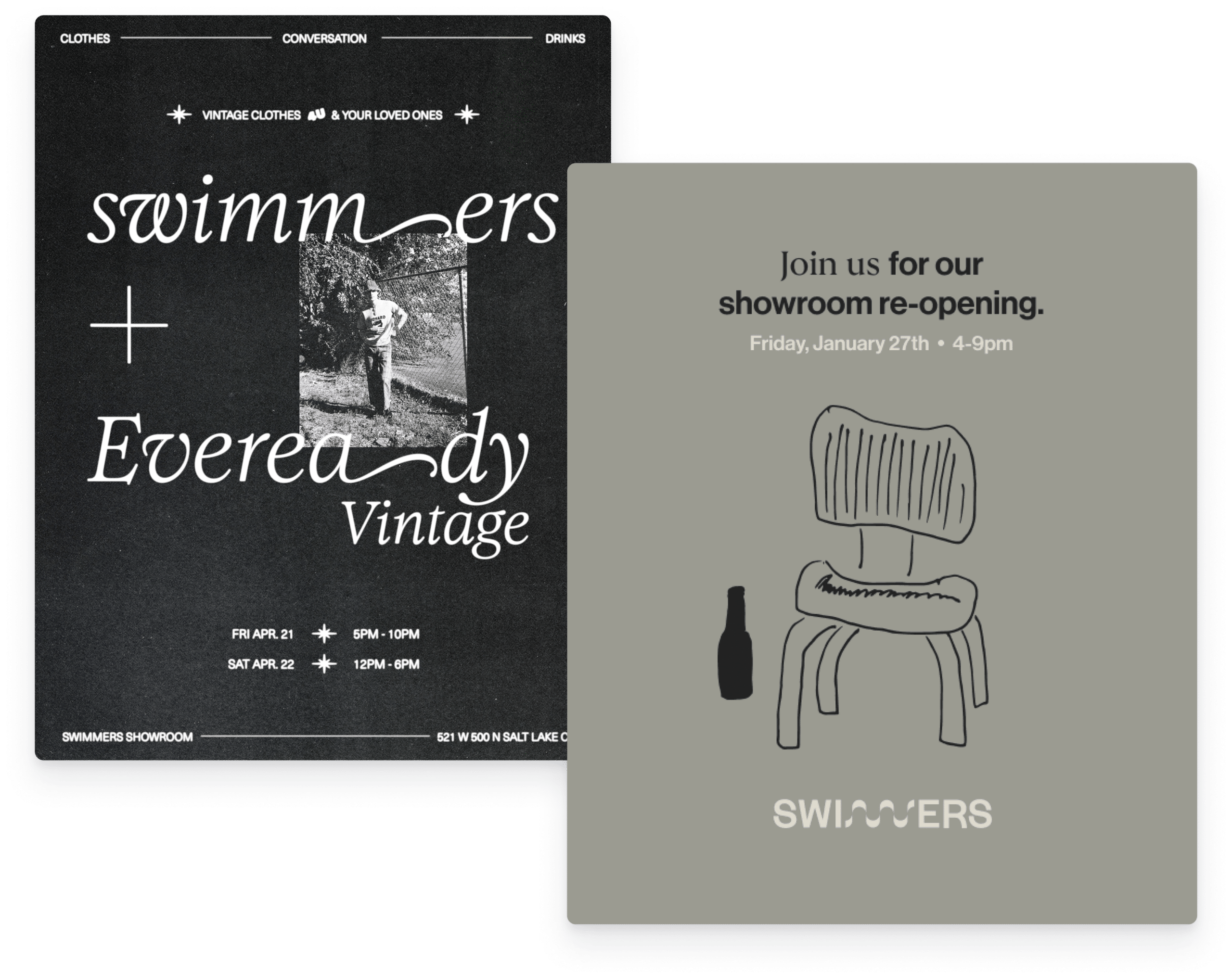
Beyond the online shop, our collaboration extended to a range of graphic design projects that reinforced SWIMMERS’ brand identity. I created window graphics for the storefront, an A-frame sign to attract passersby, event posters to capture the essence of their vintage pop-up events, and even the hang tags, all of which are subtle yet essential components of their brand identity.
Maintaining a cohesive design language across these diverse projects was a top priority. I worked closely with SWIMMERS to ensure that each design element resonated with the store’s vintage, quirky, and classic identity. Elements like color choices, typography, and the careful incorporation of film photography were thoughtfully considered to reflect the store’s unique personality.
SWIMMERS’ transformation from a local vintage clothing store to a flourishing brand with a notable online presence and a distinct visual identity underscores the influence of effective graphic and UX/UI design. Our collaboration serves as evidence of the substantial impact of thoughtful, consistent design work on a brand’s success.

Shoreline
Health
Lead Product UX/UI, Graphic Design
2022-Present
As a UX/UI designer at Anchor & Alpine, I’ve played a pivotal role in shaping the comprehensive design of Shoreline Health’s patient education system. Our objective was to craft an intuitive and effective content hub tailored to the unique needs of oncology clinicians and their patients. Working alongside my fellow UX/UI designer, we collaborated closely with Shoreline Health’s founder and lead developer, dedicated to establishing the user experience, designing user flows, and crafting an engaging user interface.
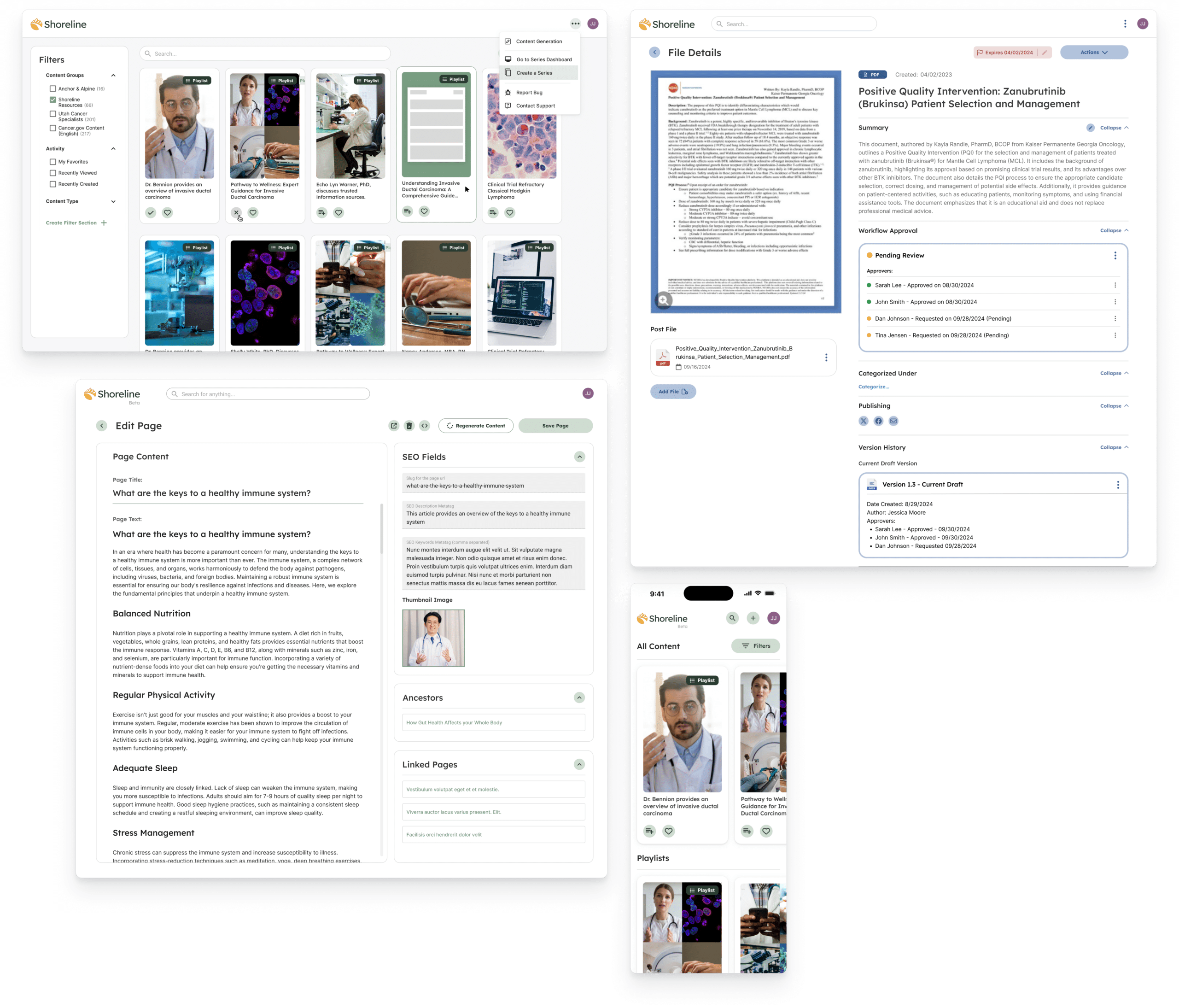
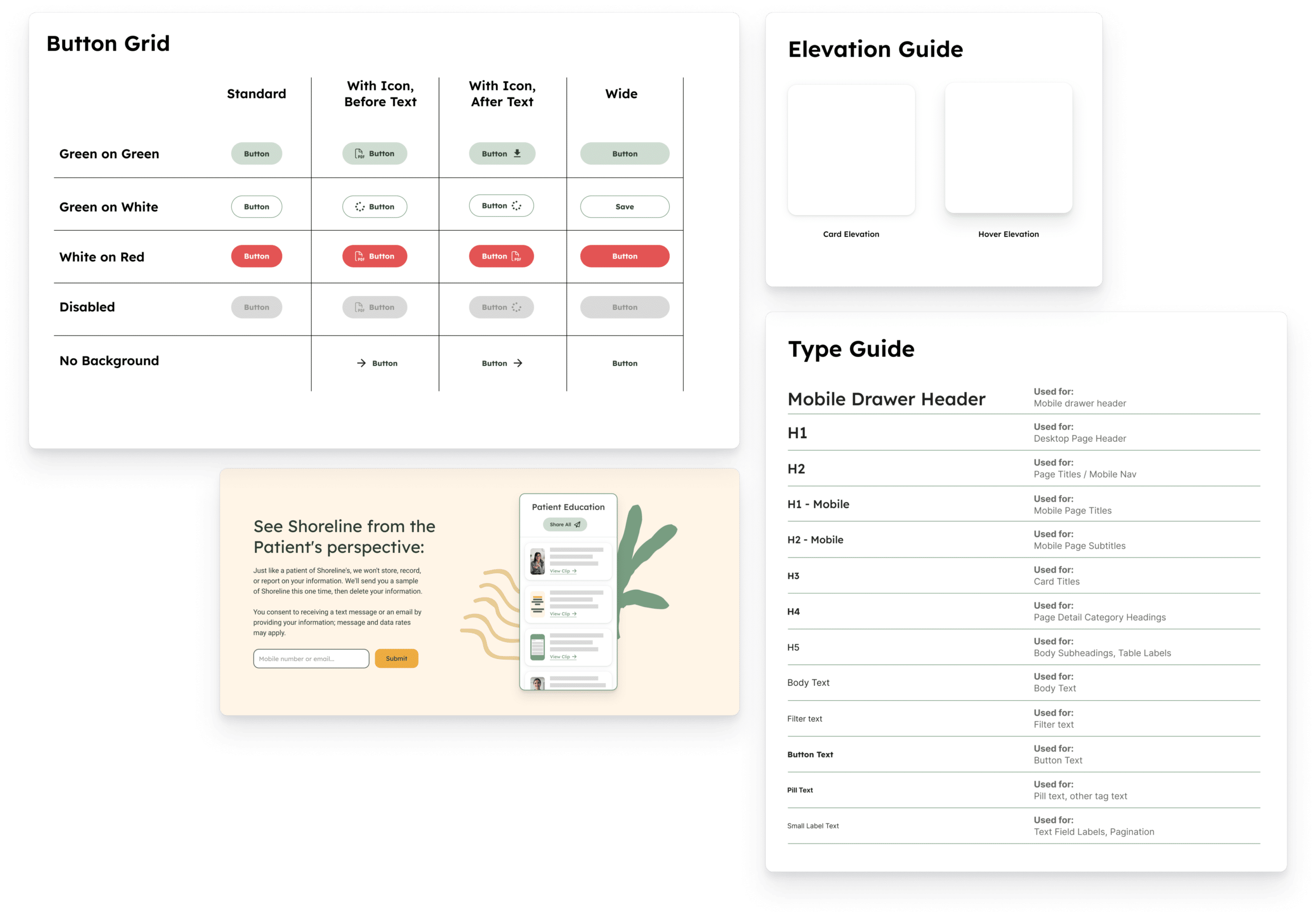
Our project commenced with the creation of a bespoke design system, carefully tailored to Shoreline Health’s specific requirements. Leveraging the MUI React components as our foundation, we thoroughly customized them, ensuring seamless integration while preserving the platform’s distinctive identity. My responsibilities included defining type styles, establishing a hierarchy, and crafting a visually harmonious user interface.
The core of my contributions has been the creation of high-fidelity mockups for both desktop and mobile interfaces. These mockups encompassed essential pages of the platform, such as the home collections page, playlist view, patient communication emails, and artifact detail pages.
Our primary challenge was to design a system that would empower clinicians to efficiently compile and deliver a curated set of educational resources to their patients. Simultaneously, it was imperative that we ensure patients could seamlessly access and navigate these resources on the Shoreline platform. Striking this balance and meeting the diverse needs of both user groups were pivotal to the product’s success.
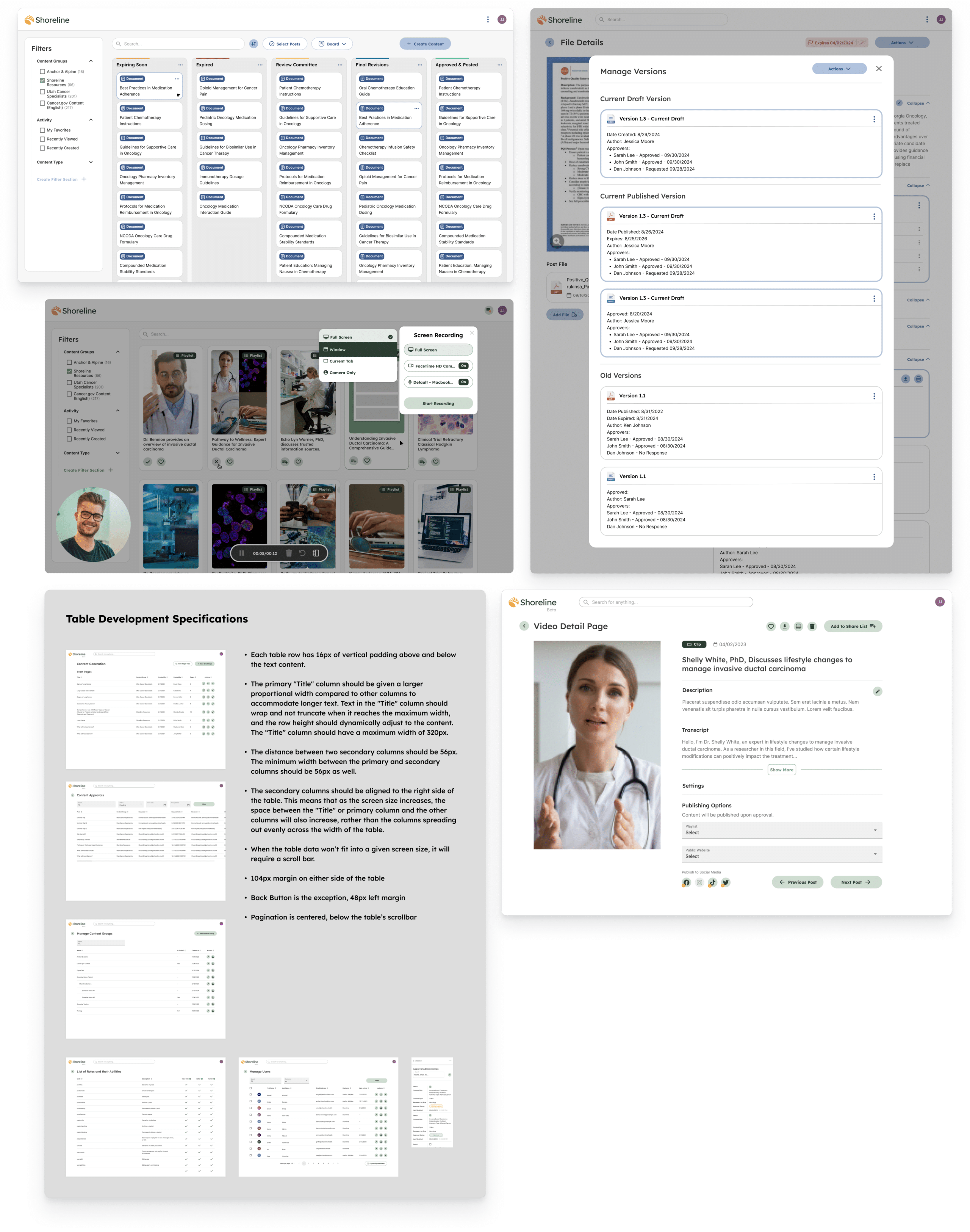
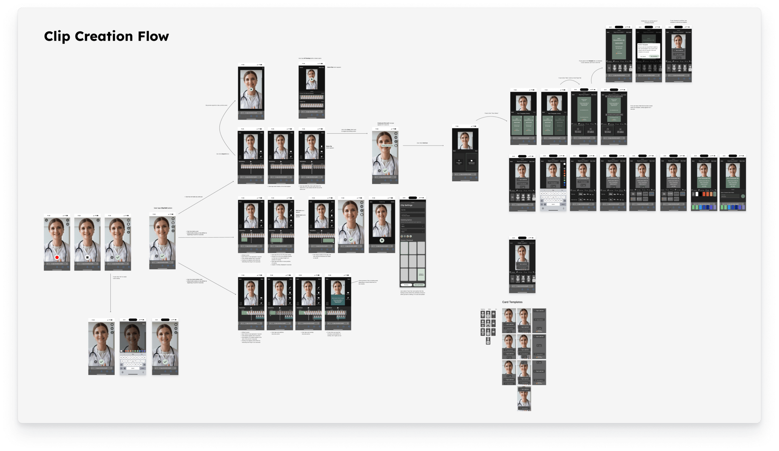
The resulting platform was successfully launched. Ultimately, the product simplifies the workflow of patient education for oncology clinicians, allowing them to efficiently manage, organize, and deliver valuable resources to their patients. The system centralizes information resources, automated approval workflows, enables video clip recording, and facilitates playlist creation.
Our approach was user-centric, ensuring patients could easily access materials and share them with friends and family. The platform was designed with accessibility and user-friendliness at the forefront, ensuring both oncology clinicians and patients could effortlessly navigate and interact with educational resources.
The success of the project became evident as Shoreline Health quickly established partnerships with local hospital groups, with plans to expand their customer base in the near future. By designing features that centralize information resources and facilitate content delivery in various formats, we’ve enabled oncology clinicians to provide valuable resources to their patients more efficiently.
As a UX/UI designer on the project, I’ve been happy with our efforts to create a patient education system that simplifies information sharing for clinicians and patients. It’s a product that we hope will represent a significant step forward in how clinicians and patients interact, share information about diagnoses, treatments, and ultimately become more empowered and healthier.
MarketDial
Product, UX/UI, Lead Website Design
2021-2023
As a UX Designer for Anchor & Alpine, I had the privilege of working with MarketDial, a tech company that specializes in data-driven testing software and services for brick-and-mortar businesses in various industries, including grocery, retail, restaurants, and convenience stores. Their mission is to revolutionize traditional in-store pricing and promotion models with data-driven, scientific approaches. My journey with MarketDial began in 2021 when they partnered with Anchor & Alpine to elevate their user experience with a comprehensive two-year product UX/UI project, which later expanded to encompass a new custom website design. My role evolved from Lead UX/UI Designer on the product to Lead UX Designer on their website project. Over this time, I overhauled two significant product features and led our team in creating a modern website that has significantly enhanced MarketDial’s image and demand generation.

Product
My work on MarketDial’s product primarily revolved around two key features: the “Test Building Wizard” and the “Lift Explorer.” The Test Building Wizard serves as the gateway to MarketDial’s product, allowing users to create tests for a selection of their stores. This feature guides users through designing experiments, including selecting locations, products, and controls. I collaborated extensively with MarketDial’s product manager, lead data scientist, and developers to improve the user experience and overhaul UI elements that had been implemented without design guidance. Research, user interviews, and the creation of detailed product maps and user personas laid the foundation for these improvements.
The redesign of the Test Building Wizard addressed its linear and cumbersome nature, introducing a tab-based navigation system with progress bars for a more flexible and user-friendly experience. I reimagined various UI components, including form fields, cards, charts, and buttons. Additionally, I introduced a “shopping cart” view and a comprehensive review page at the end of the wizard to provide users with a clear summary of their selections and accomplishments. This redesign has since been implemented and contributed to MarketDial’s acquisition of more rounds of venture capital and an impressive roster of clients.
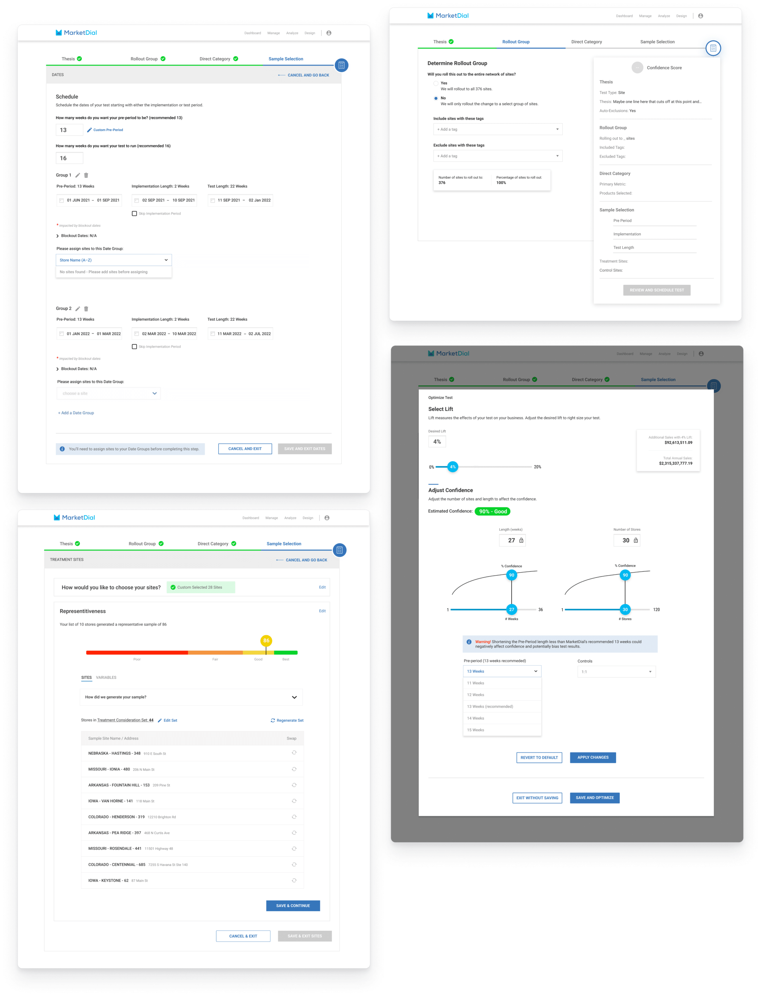
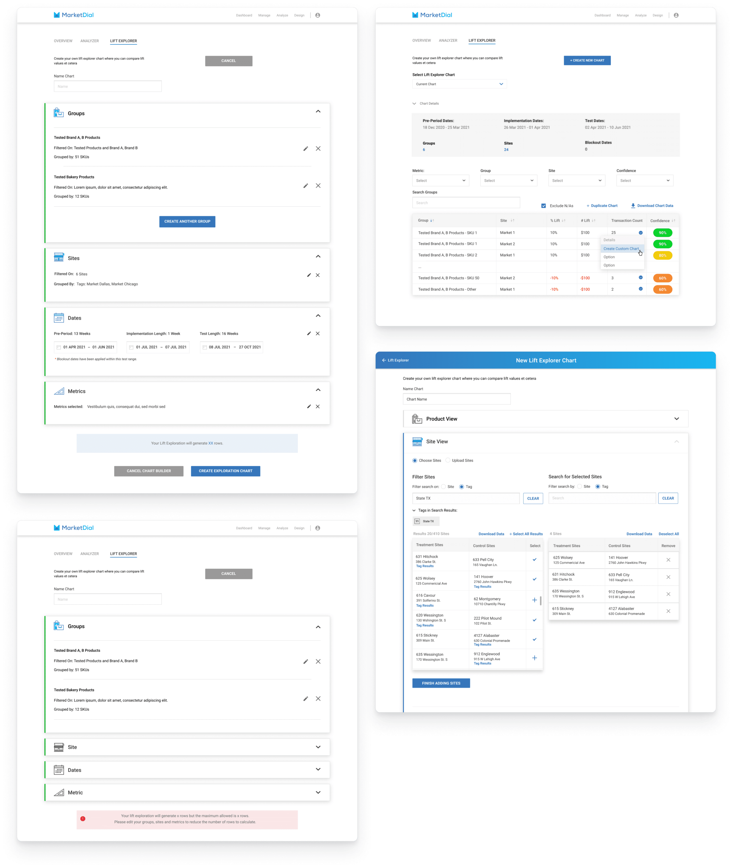
I also designed the “Lift Explorer” feature from the ground up, conceptualizing a comparative chart builder that MarketDial customers had long requested. This feature enables users to explore how different variables affect the revenue lift generated by their retail tests. The feature was meticulously developed, tested, and launched, offering a vital tool for MarketDial customers.
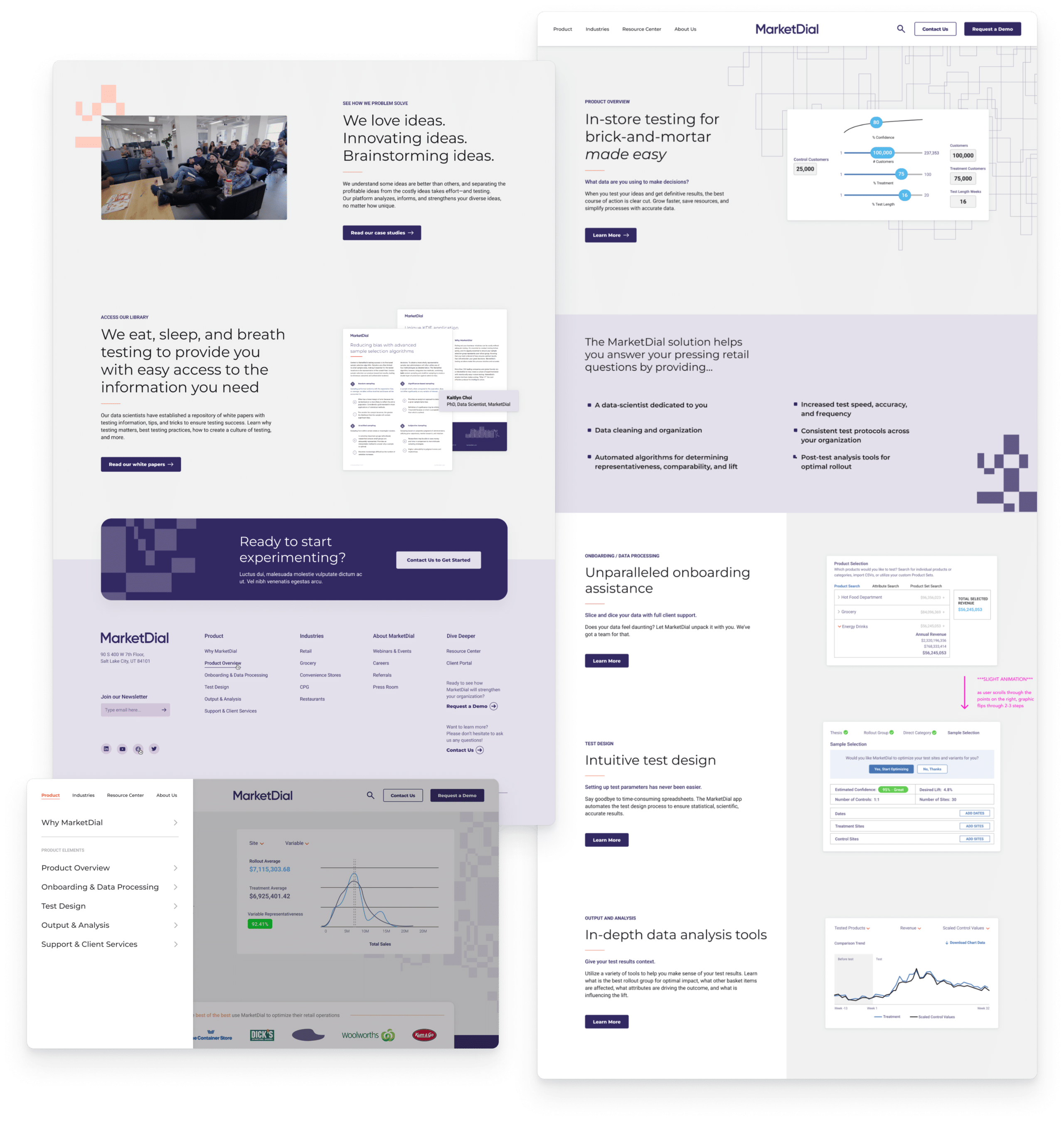
Website
MarketDial’s growth led to the need for a demand generation website. In this project, I served as the lead designer, creating a clean, modern, and user-friendly website that reflects MarketDial’s evolving brand identity.
Before commencing the design, our approach included in-depth UX interviews with MarketDial’s customers, helping us gather valuable insights to inform the new site. The uniqueness of this website launch lay in the incorporation of testing different homepages that I designed, aligning with MarketDial’s core value of data-driven decision-making. This approach allowed MarketDial to practice what they preach by testing various messaging and graphics to optimize their website for the most positive impact.

Within the first month of the website launch, MarketDial was able to hone their messaging and graphics based on data-driven insights, further enhancing the effectiveness of their online presence. This data-centric strategy has not only reinforced MarketDial’s commitment to data-driven decision-making but also delivered substantial results.
Our team worked closely with MarketDial to design and develop a WordPress website that not only reflected their new brand identity but also provided them with the flexibility to easily edit and update content. The website was meticulously crafted with a user-friendly interface and an intuitive backend, allowing MarketDial to seamlessly manage their website content, keeping it up-to-date without the need for extensive technical knowledge.
The collaboration with MarketDial has been a journey of continuous improvement and innovation, emphasizing the importance of user-centered design and data-driven decision-making. The comprehensive product UX/UI enhancements and the creation of a modern website have not only streamlined MarketDial’s digital presence but have also significantly contributed to their success, growth, and the acquisition of new clients.
Bout Time
Pub & Grub
Lead UX, Website, Graphic Design
2022-2024
Bout Time Pub & Grub, a sports bar & restaurant chain with 17 locations in Utah and Colorado, embarked on a journey to modernize their brand identity and online presence. My collaboration with Bout Time Pub & Grub began in April 2022 when they partnered with Anchor & Alpine, the agency I work for, to design and develop a new website and rebrand their logo. Our shared objective was to bring Bout Time into the modern era, transforming their outdated website into a robust platform capable of handling increased traffic and demand from their customer base. My role as Lead UX Designer allowed me to guide the project from research and wireframing to visual design, QA, and its successful launch.

To truly understand Bout Time Pub & Grub’s atmosphere, clientele, and menu offerings, our team visited one of their locations and had lunch. This firsthand experience was essential in crafting a design that resonated with the brand.
A comprehensive competitive analysis was conducted, exploring local and national bar & restaurant chains to gain insights into user flows related to online ordering, event promotion, and menu layout. Collaborating with Elle Marketing, we received a repository of high-quality photos showcasing Bout Time’s food and interiors. These images played a pivotal role in envisioning a design that incorporated large-scale, enticing visuals to transport users into the heart of the Bout Time experience.
With the images and our colleagues’ redesigned logo in mind, I created wireframes designed for both desktop and mobile interfaces. These wireframes utilized a modular system of fold-tall blocks with rounded corners, offering a dynamic yet user-friendly platform. Since the site would be built on the WordPress platform, these blocks would empower the client to mix and match elements with ease.
The design focus was on creating a visually striking homepage, a user-friendly header navigation menu, a prominently featured page for locating the nearest Bout Time location, and a comprehensive events page. The events page enabled visitors to search, filter, and register for the numerous sports-related gatherings Bout Time frequently hosts. The design aimed to convey the brand’s lighthearted and fun personality, incorporating dynamic elements like a crawling banner, colorful loading bars within accordions, and engaging hover states for cards. Given the extensive menu sections and items, I introduced a responsive anchor-linked menu with tabs for each section to simplify navigation and eliminate any sense of overwhelm.
Working closely with our developers, I conducted extensive Quality Assurance (QA) to ensure the visual elements, user flows, and responsiveness of the new design met our standards. Since the website’s launch, the positive sales data showcases an increase in both online ordering and visitorship, underscoring the success of our collaborative efforts.
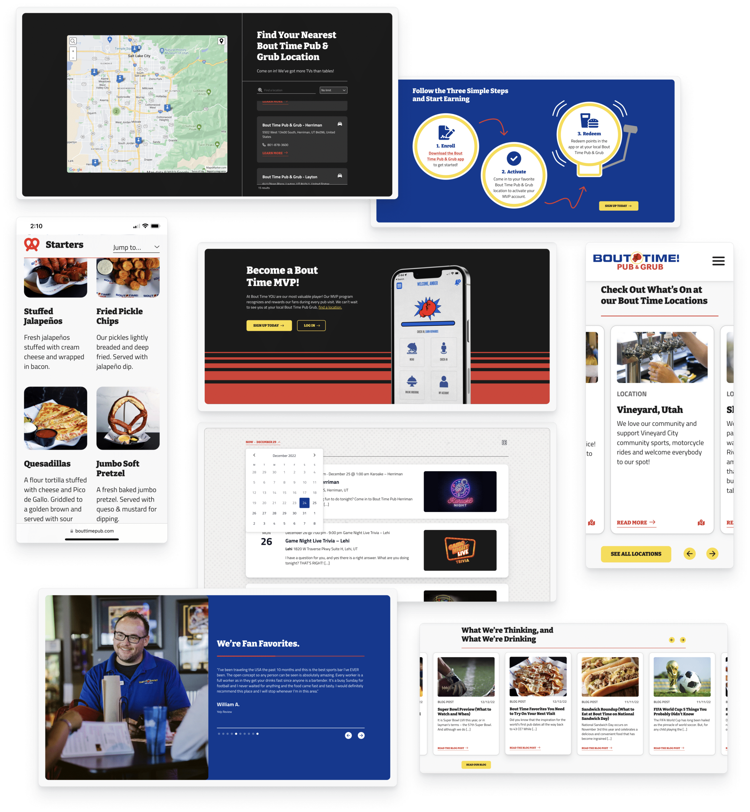
The project resulted in a functional and visually appealing website that authentically conveys Bout Time Pub & Grub’s brand personality. It has established a robust online presence for the company, contributing to a notable uptick in sales and visitor engagement. Bout Time continues to be a valued client of Anchor & Alpine, a testament to the high performance of their new website. The collaborative effort, merging UX/UI and graphic design, played a pivotal role in redefining Bout Time’s digital presence, and I’m proud of the positive impact we’ve had on their business.
Tulie Bakery
Lead UX, Website Design
2020-Present
Tulie Bakery, a renowned bakery with two Salt Lake City locations, enlisted my services in 2020. The founder, Leslie Seggar, contracted me to redesign their website in collaboration with freelance developers from Team Five Three. Our primary goal was to create an elegant and easily updatable website that could accommodate changes in the menu, policies, and seasonal offerings. Known for its meticulous aesthetic, both in physical spaces and product presentation, Tulie Bakery required a website that matched its minimalistic refinement and sophistication.
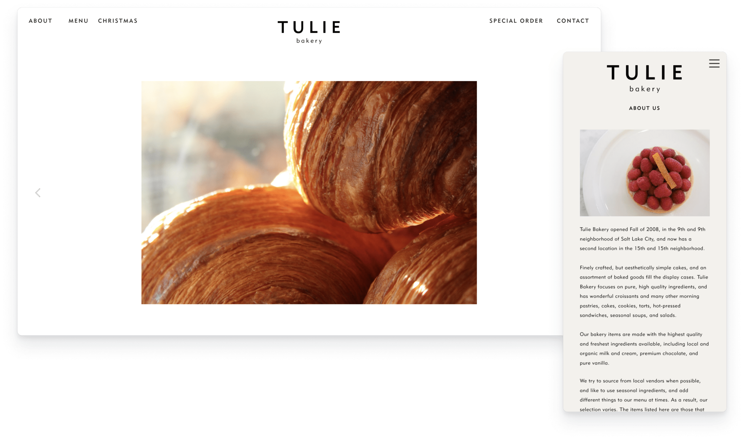
To meet Tulie Bakery’s budget constraints and the need for a user-friendly backend, we devised a website based on a customizable CMS template with efficient CSS customization. While several CMS templates met these criteria, Tulie Bakery sought a unique and fully customized design. After careful evaluation, we selected the Cargo site building platform, offering a balance between customizability and user-friendliness. We opted for a template that featured built-in interactions, yet allowed us the creative freedom to craft a distinctive design.
As a longtime Tulie Bakery customer, I aimed to replicate the effortless, minimalistic experience of visiting their physical locations in the website’s user experience. I wanted the website to feel just like walking into the bakery for a croissant and espresso. To achieve this, I selected a template that employed a single, long-scrolling page with multiple fold-height sections. The template provided ample room for customization, allowing me to create high-fidelity mockups and even dabble in simple CSS. Collaborating with the developers, we implemented anchor links in a sticky header navigation menu, ensuring smooth scrolling navigation to various areas within the site. Through biweekly meetings with Tulie and Team Five Three, I fine-tuned the design for both practicality and beauty.
Seggar takes pride in her brand’s quiet luxury, and we strived to convey this identity in the final product. The website featured alternating tones of white and tan, employed the Geometric 415 typeface in various well-kerned weights, incorporated generous whitespace, and showcased sharp, detailed images of their delectable offerings. The centerpiece of the site was Tulie Bakery’s menu, cleverly organized into a navigation menu mirroring the physical menu’s appearance and feel.
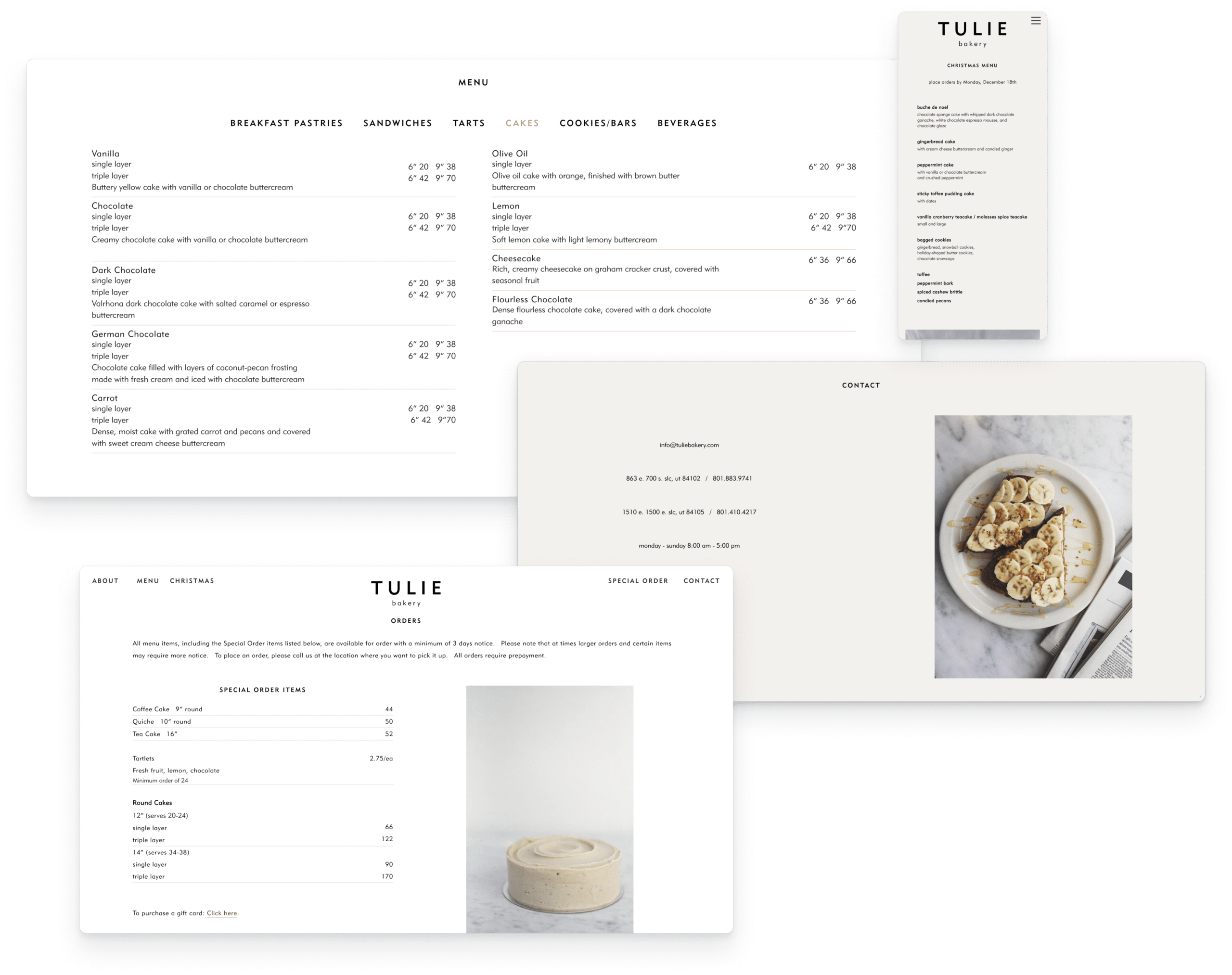
After rigorous iteration and quality assurance, the website was launched in two months. The result has proven to be a perfect fit for Tulie Bakery. Seggar is delighted with the site’s aesthetics and its newfound ability to accommodate timely edits. Communication with customers has become clearer and more streamlined, positively impacting the business. Following the launch, I continued to collaborate with Tulie Bakery, assisting with website maintenance and adding/removing temporary holiday menu sections as needed.
As I transitioned from freelance work to joining the Anchor & Alpine agency, I was able to bring Tulie Bakery on as a client. They remain one of our valued clients to this day.
Avalanche
Software
Lead UX, Website Design
2024
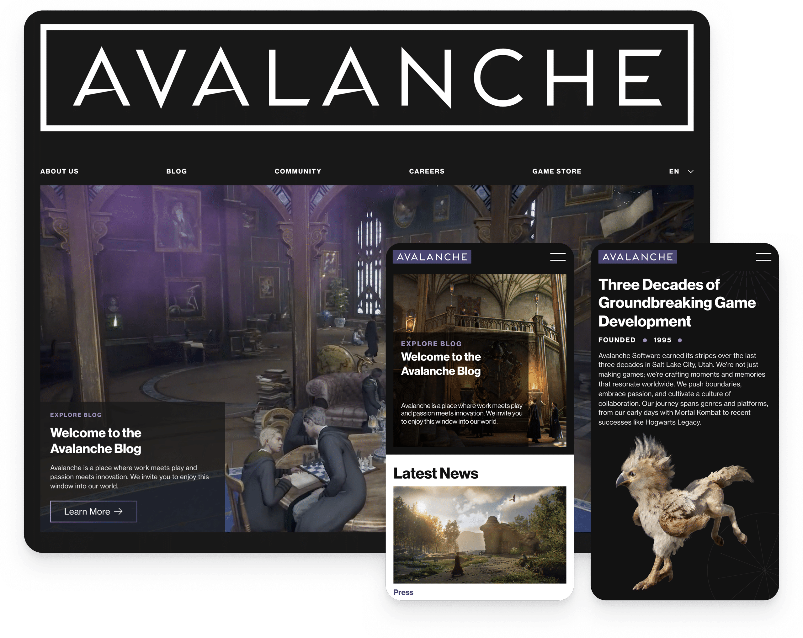
While working as a UX Designer at Anchor & Alpine, I had the opportunity to lead the design of Avalanche Software’s new website. Known for Hogwarts Legacy and decades of groundbreaking games, Avalanche wanted a site that captured their creative spirit, showcased their work, and connected with their vibrant community. Collaborating with my team, including two other designers, and working closely with Avalanche’s marketing team and art director, we created a site that reflects who they are as a studio.
Project Goals:
Easy Updates: Knowing the site would be frequently updated with news, job postings, and fan content, we prioritized creating a setup that allowed their team to make edits without hassle.
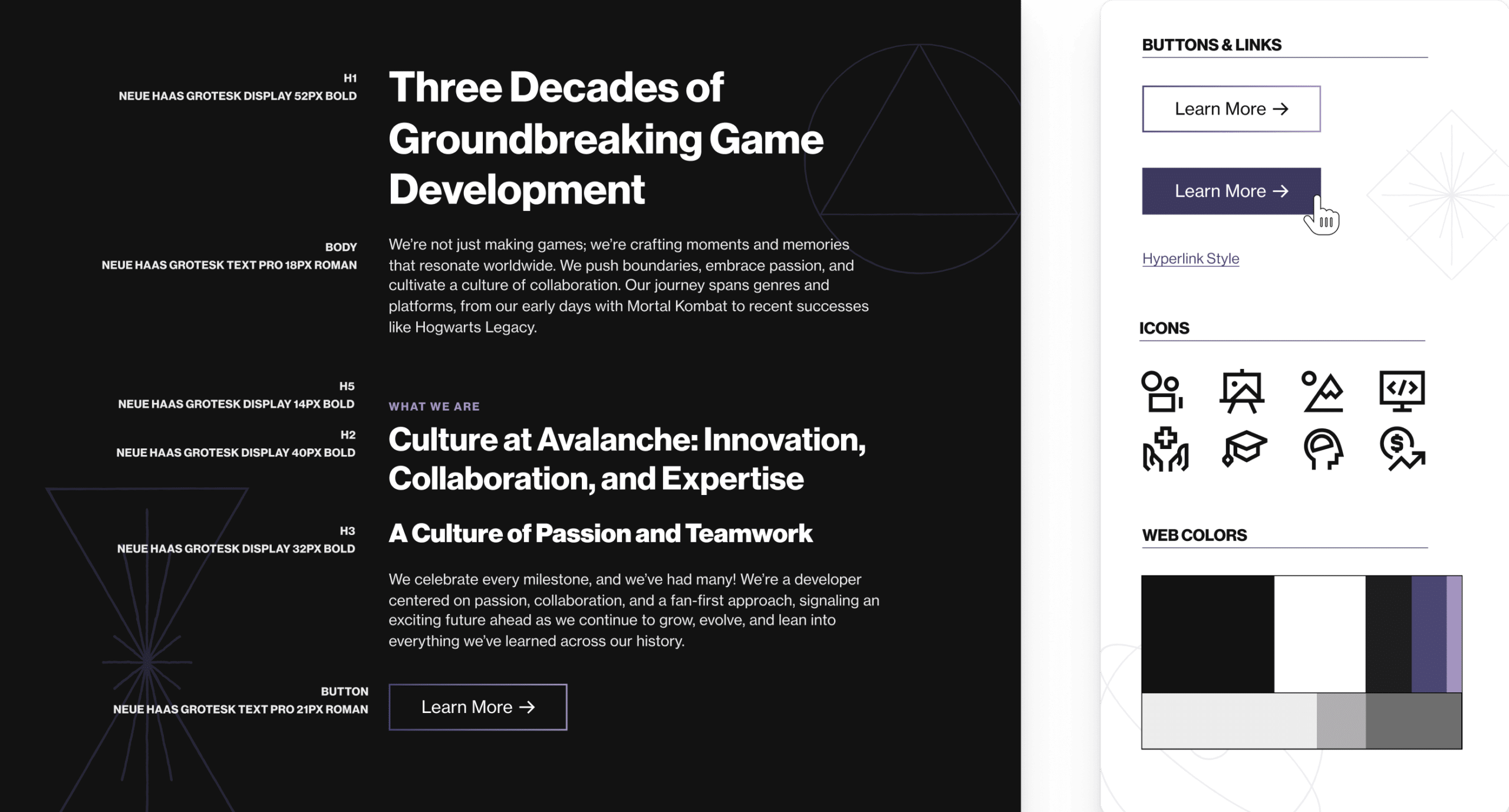
Reflecting the Brand: We established fonts, colors, and icons that aligned with Avalanche’s personality—bold, imaginative, and fun—while maintaining a professional edge.
Visual Engagement: Using immersive imagery and dynamic video elements, we aimed to give visitors a sense of the energy and magic that defines Avalanche’s work.
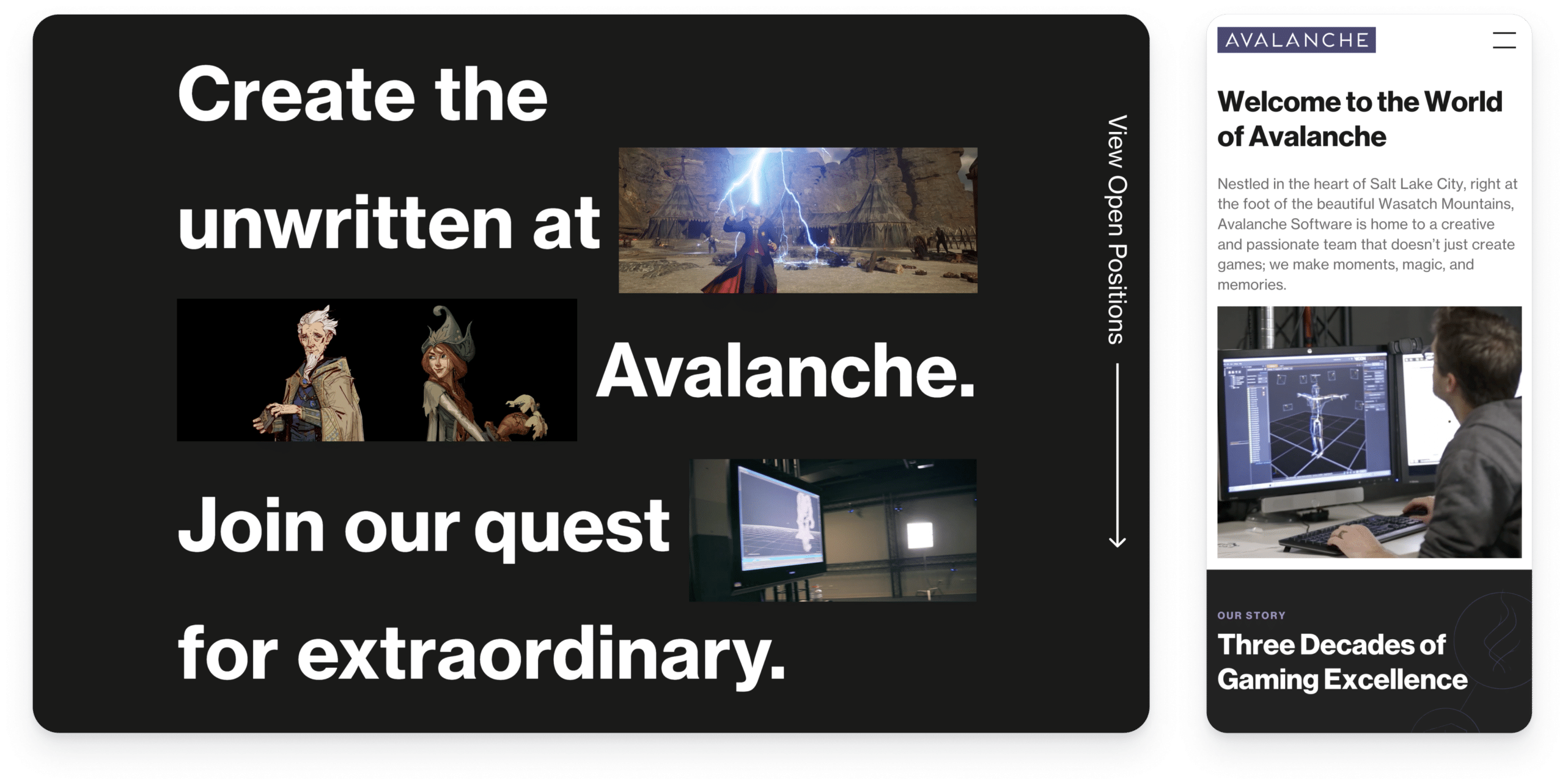
Key Design Elements:
Intuitive Navigation: The layout and structure were designed to make exploring their games, career opportunities, and community initiatives as smooth and engaging as possible.
Animated Runes: Inspired by Avalanche’s games, these animations add subtle movement and interactivity, creating a thoughtful and engaging user experience.
Mobile-First Design: We made sure the site feels just as impactful on mobile as it does on desktop, giving users seamless access no matter how they visit.
Result: The redesigned website is more than just a portfolio—it’s a digital extension of Avalanche’s studio identity. It’s helped them showcase their work in a way that feels authentic while also serving as a powerful tool for recruitment and fan engagement. Collaborating on this project was incredibly rewarding, blending imagination and usability to create something Avalanche is excited to share with the world.

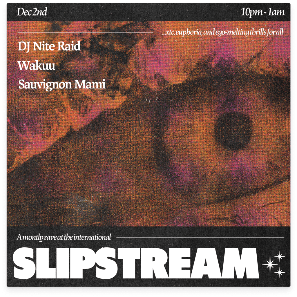
International
Bar
Graphic Design
2022-Present
Since 2022, I’ve been designing flyers for Slipstream, a monthly dance and house music night hosted by DJs Sauvignon Mami and DJ Nite Raid at the International Artists Lounge in Salt Lake City, UT. This ongoing project has allowed me to explore a variety of graphic styles while staying true to the high-energy, euphoric spirit of the event.
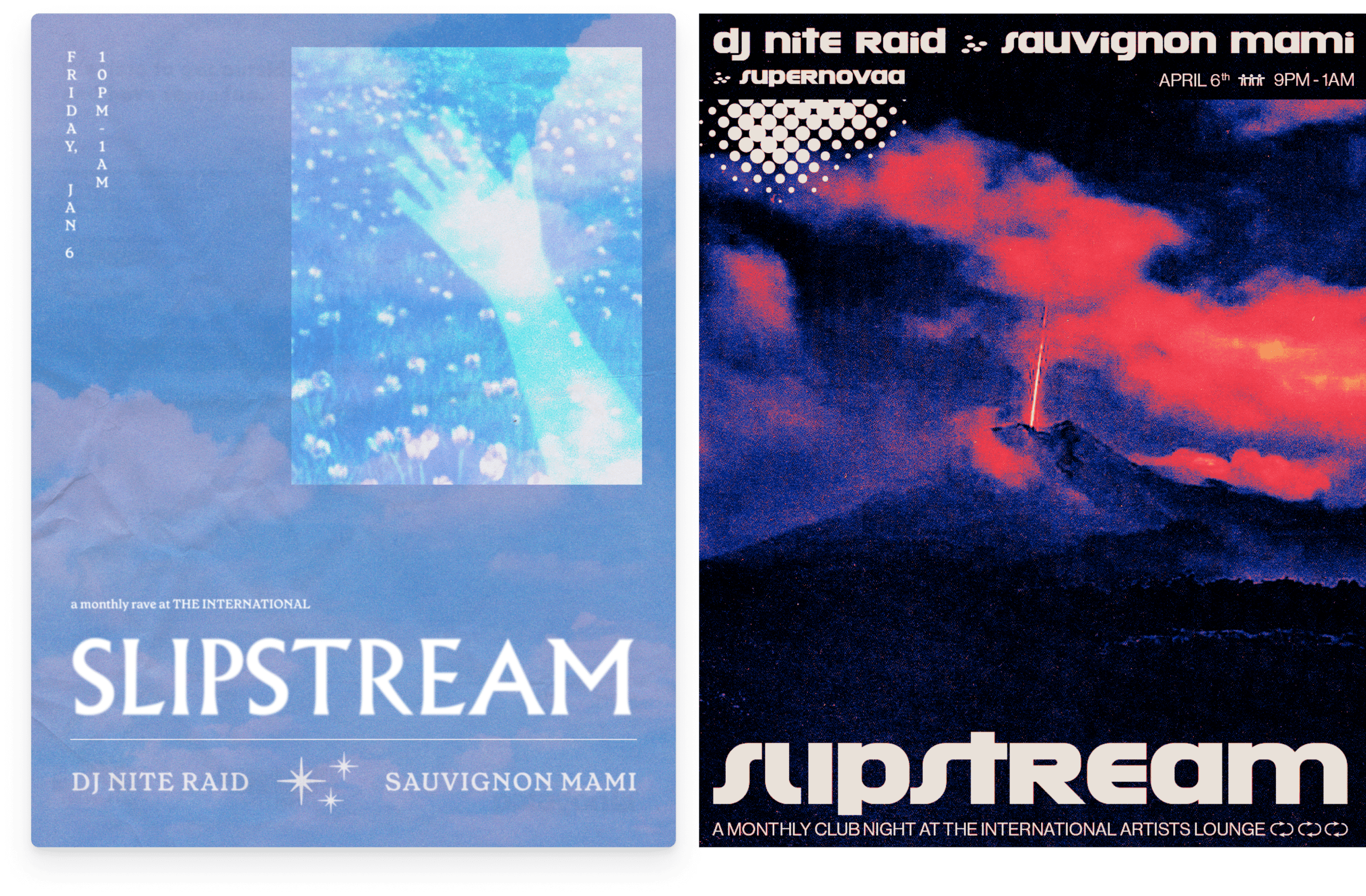

Slipstream was created to fill a void in the local subculture—a lack of dance-focused, high-energy events featuring house, dance, and techno music. The event is as much about cultivating a community as it is about creating a space for fun, music, and cool visuals. Each flyer needed to convey the unique vibe of the event while serving practical purposes for print distribution and social media promotion, primarily on Instagram.
Multi-Purpose Design: Create flexible designs optimized for both print and digital platforms.
Energy and Appeal: Capture the euphoric and dynamic atmosphere of the event to excite attendees.
Cultural Relevance: Reflect the aesthetic of the dance music subculture in Salt Lake City, balancing bold, edgy visuals with approachable, fun elements.
Consistency: Develop a cohesive visual identity across multiple months while allowing each flyer to stand out on its own.
Each flyer starts with a discussion with the DJs to explore themes, energy, and any specific ideas they’d like to incorporate. Drawing inspiration from rave culture, experimental typography, and retro-futuristic aesthetics, I experiment with bold layouts, striking color schemes, and curated imagery.
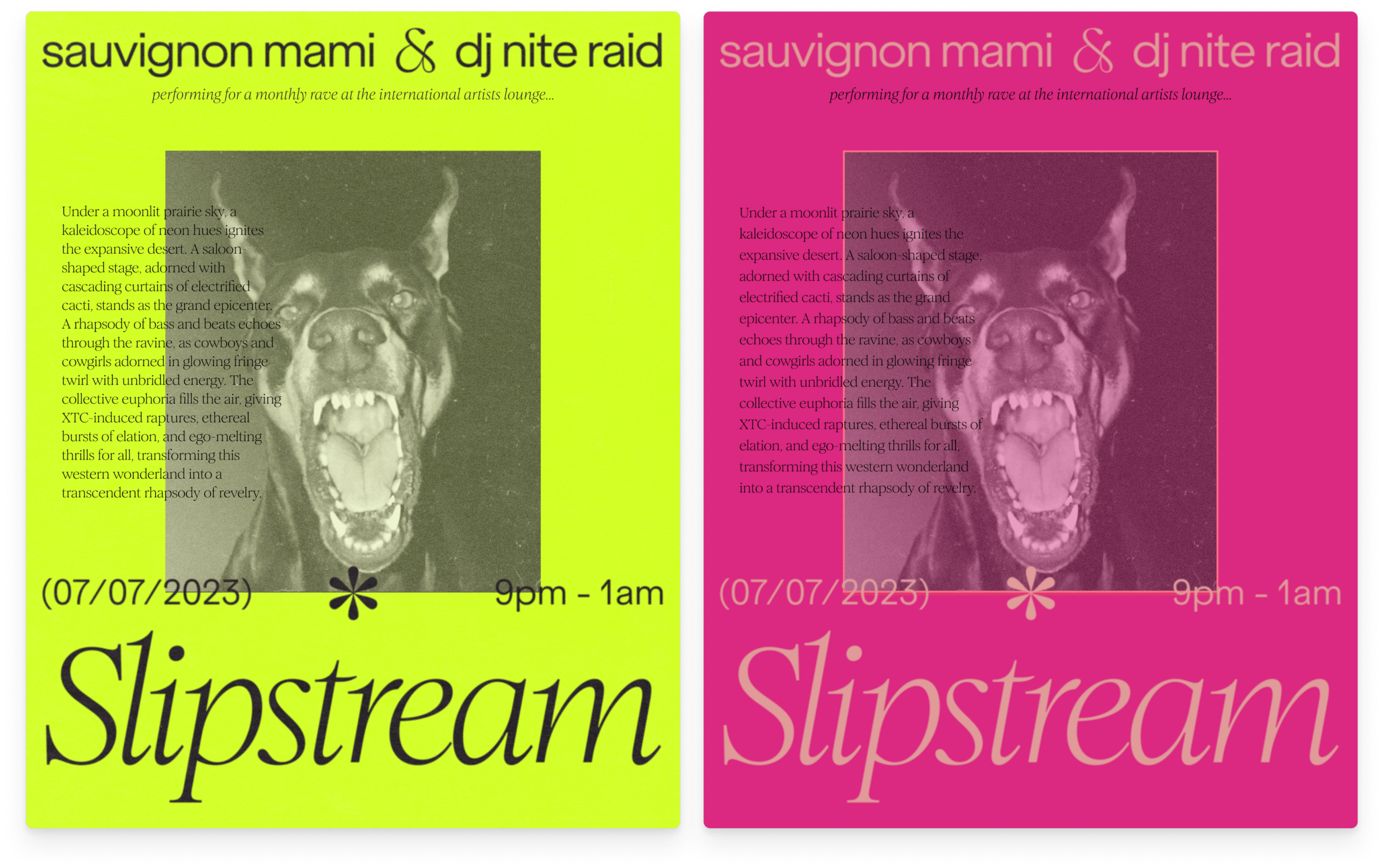
Key elements include:
Composition: Balancing the practical information (event details) with visual storytelling to make the flyers engaging and shareable.
Typography: Experimental use of custom fonts and dynamic text layouts to convey movement and rhythm.
Imagery: A mix of bold, sometimes surreal images and textures to create intrigue and excitement.
Color: High-contrast palettes with neon tones to align with the high-energy music and event atmosphere.
Outcomes: Over the past year, I’ve created over a dozen flyers, which have become a recognizable part of Slipstream’s identity. The designs have helped build excitement for the events, increased attendance, and elevated the branding of Slipstream within Salt Lake City’s dance music scene. Attendees have noted how the visuals reflect the unique vibe of the events, and the flyers themselves often spark conversations and anticipation online. Designing for Slipstream has been a rewarding opportunity to contribute to the local music and arts scene.

I’m a UX, product, and graphic designer in Salt Lake City.
Reach out to me at: